Three Blue Ducks
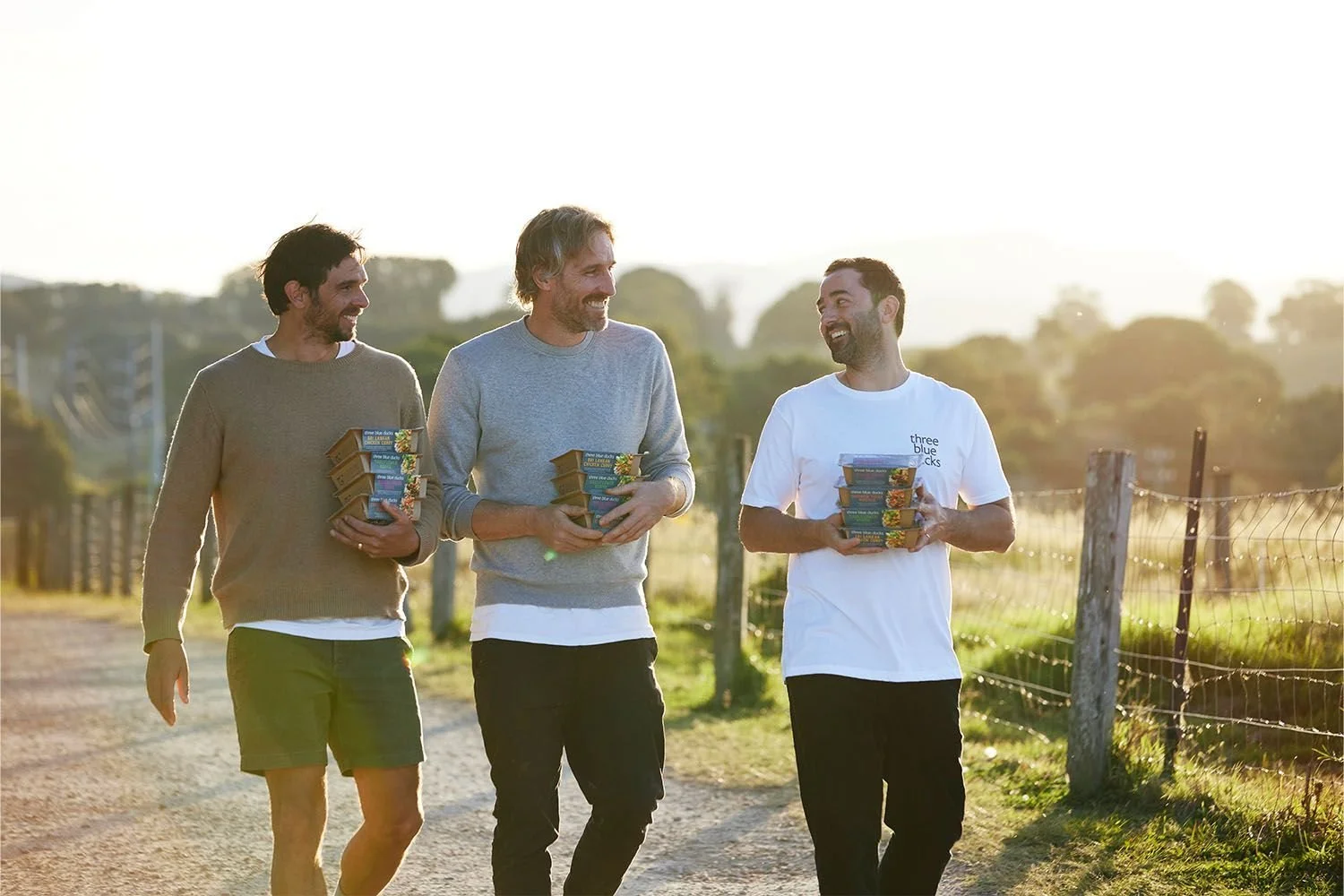
Three Blue Ducks is one of Australia's most respected restaurant groups, known for cooking that champions local produce, ethical sourcing, and honest food. When the business expanded into grocery retail with a line of heat-and-eat meals, the challenge was clear: how do you take a brand built on the experience of dining in and make it work on a supermarket shelf?

The brand had an established identity, but it had been built for a restaurant context: a logo, colour palette and the equity of a well-known name. There was no developed packaging system, no retail language, and no visual framework designed to communicate at shelf. My job was to build all of that from what existed and make it work in a completely different environment, one where the brand had seconds to connect with a shopper who might not know the restaurants at all.
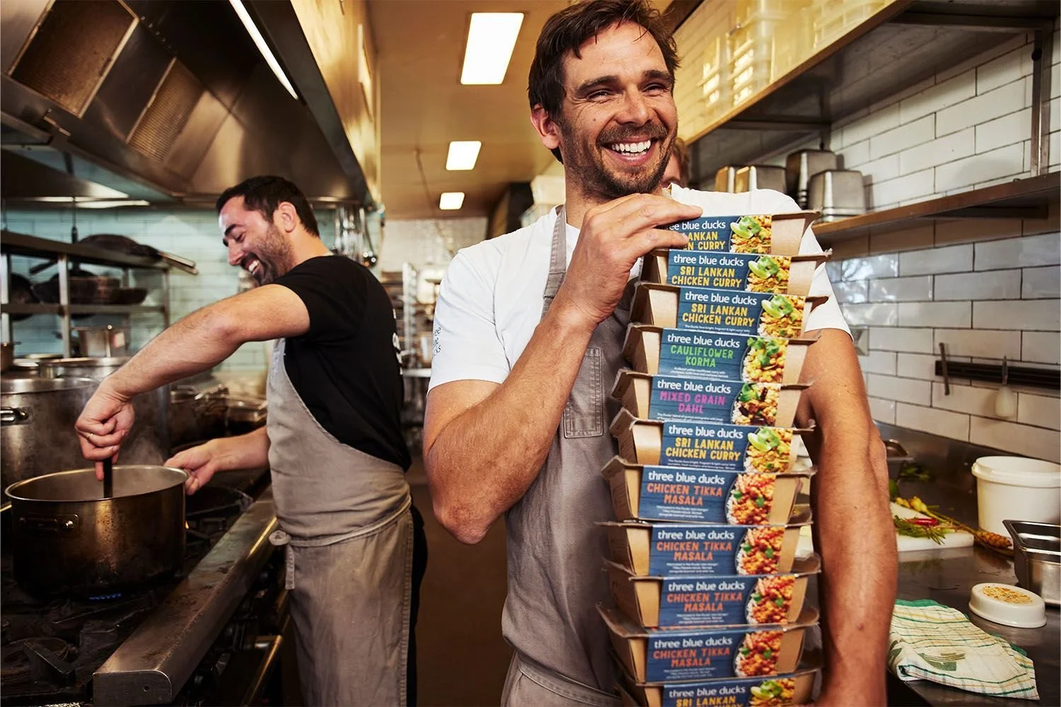
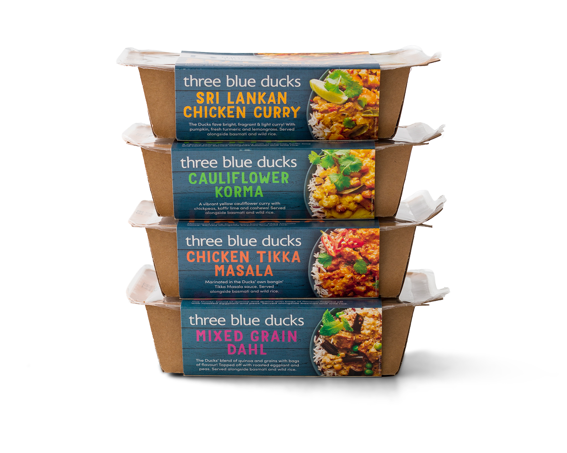

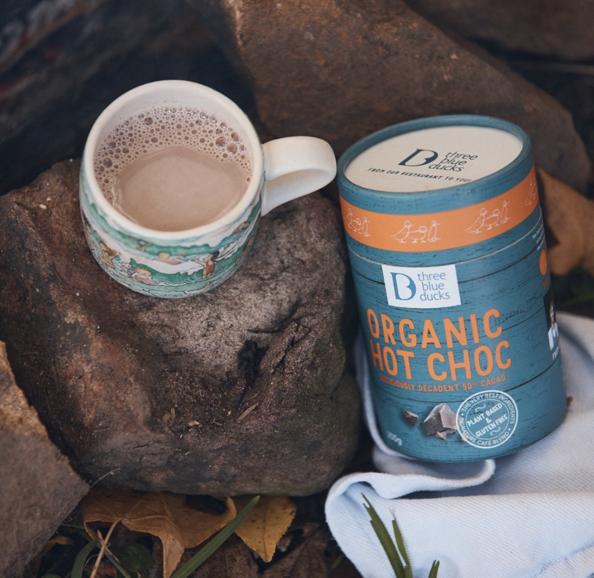

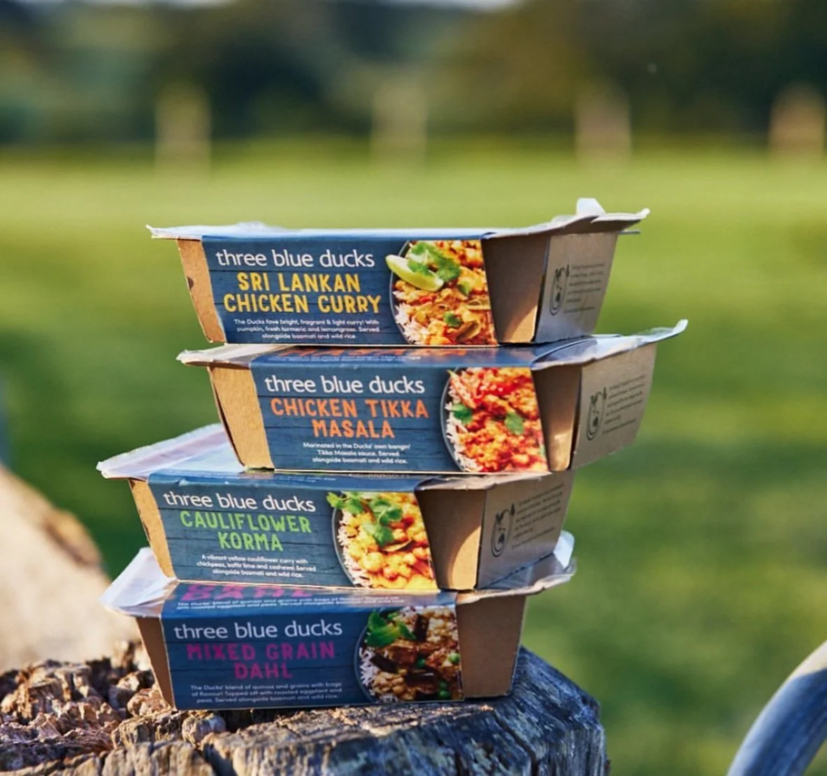
The range launched into Woolworths Metro stores across NSW and Victoria, and QE Food Stores in NSW. Four curries (Sri Lankan chicken, Tikka masala, Mixed grain dahl, Cauliflower korma), all made with around 85% Australian-sourced ingredients and packaged with recyclability front of mind. Following the success of the meals range, I also developed packaging for a Three Blue Ducks hot chocolate, extending the retail presence into a new category.


Outcome: The range launched into Woolworths Metro stores across NSW and Victoria and QE Food Stores. The project was awarded Silver at the 2024 Indigo Design Awards.
Client
Three Blue Ducks
Raise The Game
Disciplines
Brand strategy
Art direction
Packaging design
Print management
Final artwork
Photography
Andrew Young, Lantern Studio
Food Styling
Michele Cranston
Agency
Luisa Scoppa Design
Images courtesy of Delicious magazine