
Resources
The best packaging projects start well before the design does. These free resources are here to help you do that thinking, to understand what you actually need before you brief a designer, and to make sure any investment in design goes in the right direction.
Packaging Project Readiness Checklist
Know whether you're actually ready before you brief a designer. This checklist covers brand assets, product information, compliance, imagery, and the things clients often discover they're missing mid-project.
Brand Positioning Worksheet
Before packaging, there is positioning. This worksheet helps you clarify what your brand stands for, who it's for, and what it needs to achieve on shelf, before any design decisions are made.
FMCG Shelf Audit Checklist
Walk your shelf with a clear framework. Use this to assess how your packaging performs in its retail context, what's working, what's holding it back, and where the gaps are.
FMCG & Packaging Design Glossary
A reference covering the key terms used in FMCG brand strategy, packaging design, retail, and production. Built for founders and marketing teams working in consumer goods, not designers.
Packaging Design Brief
A structured brief template built for FMCG. Covers everything a designer needs to do their best work, from retail context and consumer insight through to technical and production requirements.
Australian Label Requirements
A practical guide to mandatory labelling for food, beverage, and beauty products sold in Australia. Covers FSANZ food standards, cosmetic ingredient rules, country of origin, and barcode requirements.
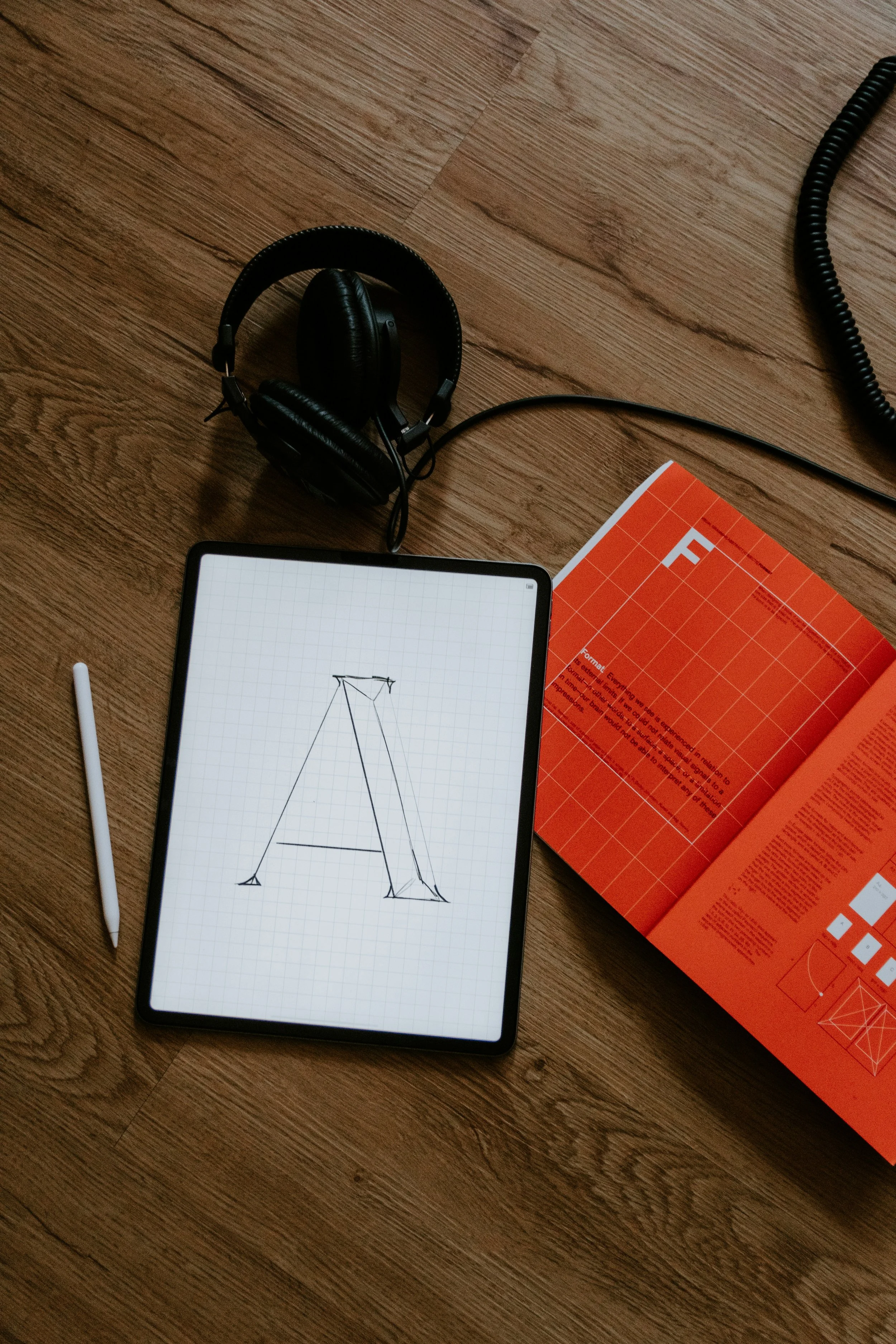
A brand is not a logo.
Here's what it actually is.
A logo is a mark. It identifies. But identification alone isn't enough, which is why the most recognisable brands in FMCG are built from a system of elements working together.
Colour registers before a shopper reads a word. It signals category, personality, and quality in a fraction of a second, and when used consistently, it becomes an asset consumers recognise without needing to see the logo at all.
Typography shapes how a brand sounds before anyone reads it. Layout and structure determine whether a range reads as a range. Imagery style, whether lifestyle photography, flat product shots, or illustrated textures, needs to be applied consistently, because inconsistency is one of the fastest ways a brand starts to look like it doesn't know what it is.
Graphic devices (a pattern, a texture, an icon system) are what make a brand feel distinctive beyond the logo itself. They give a brand depth and make it harder to imitate.
All of these elements together form a brand identity system. A logo without that system is just a mark that could sit on anything. The system is what makes a brand ownable, recognisable, and commercially effective.

These resources help you get ready. Working together helps you get it right.
The resources on this page are a starting point. They'll help you think through your brand, understand what's required, and walk into a design brief knowing the right questions to ask.
If you're ready to take that thinking further, I'd like to hear about your project.