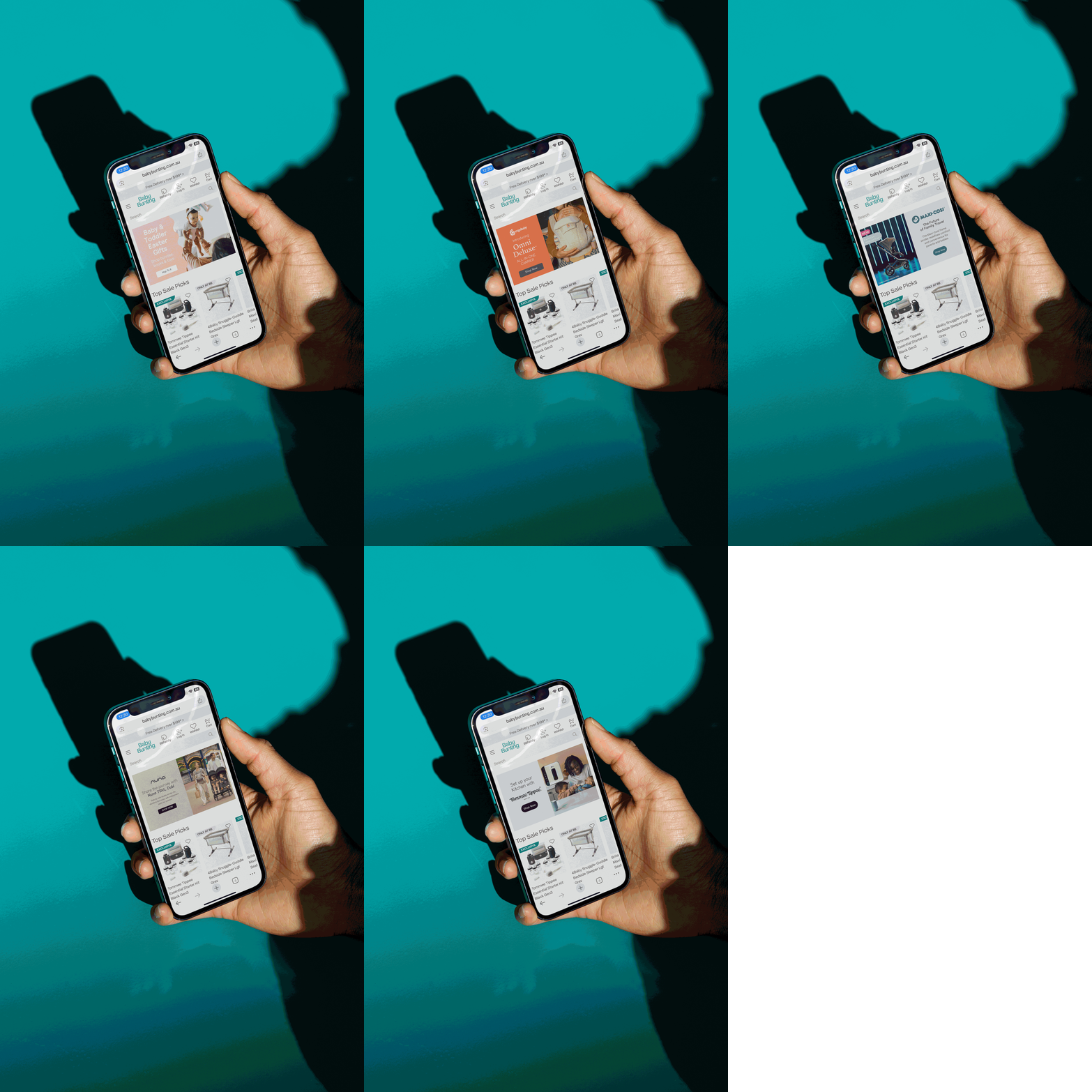
Baby Bunting
Baby Bunting's 2023 rebrand was its first major identity change in 40 years. The new system introduced a cleaner logo, a gender-neutral colour palette, and a modernised visual language built for how today's parents research, shop and engage with brands. With 54 stores nationally and a full suite of digital touchpoints to update simultaneously, the internal rollout team was stretched.
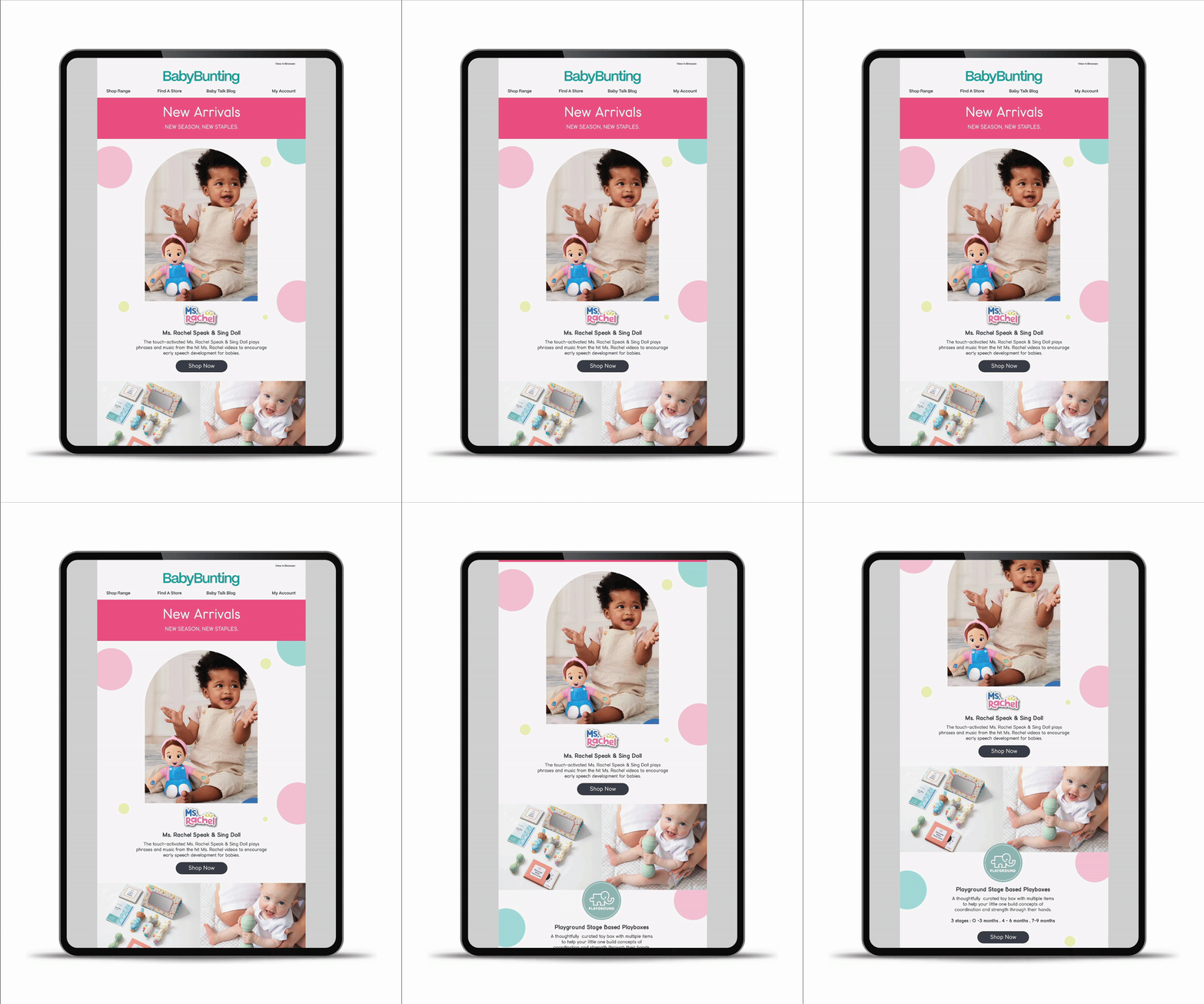
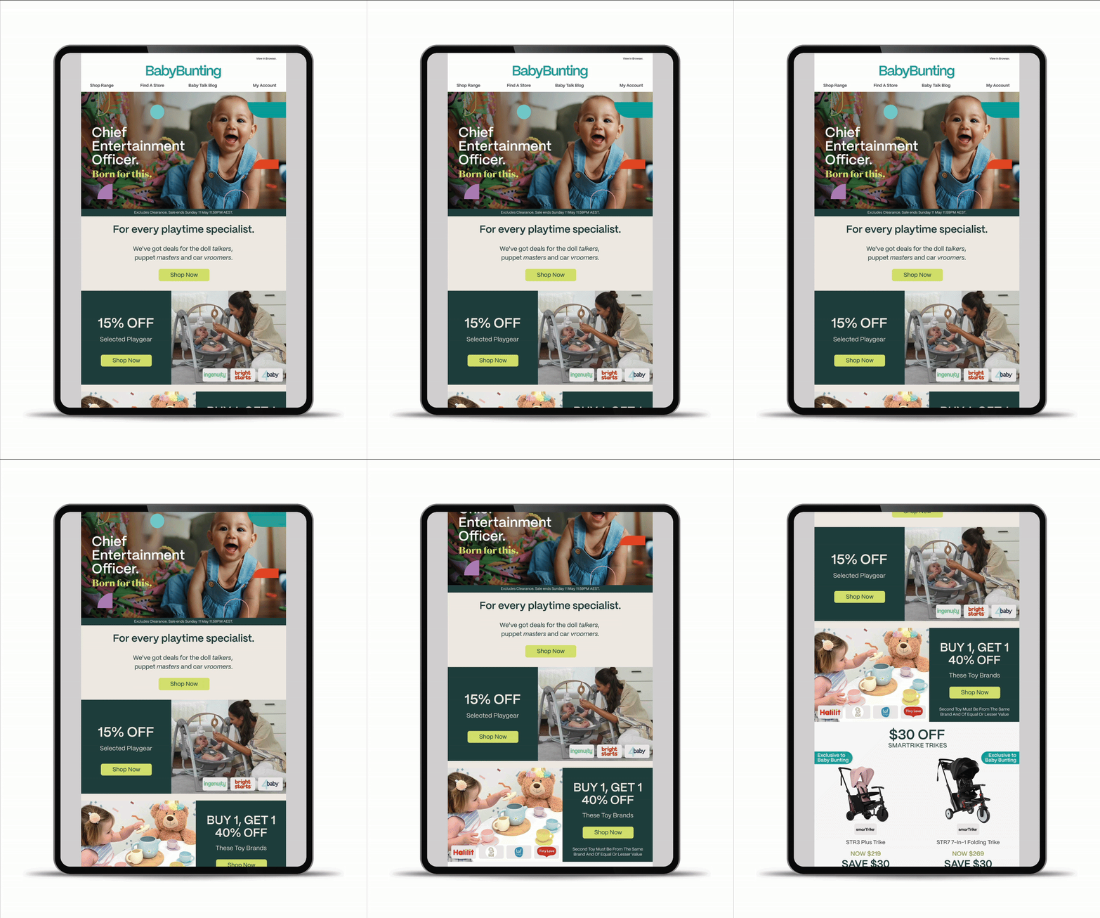
The brand system also arrived without having been fully stress-tested across digital formats. As execution began, design challenges surfaced in real time: how the palette held up inside EDM templates, how typography scaled across social formats, where the identity needed refinement to work at smaller sizes. These had to be resolved alongside the brand guidelines, which were still being developed and refined as rollout progressed.
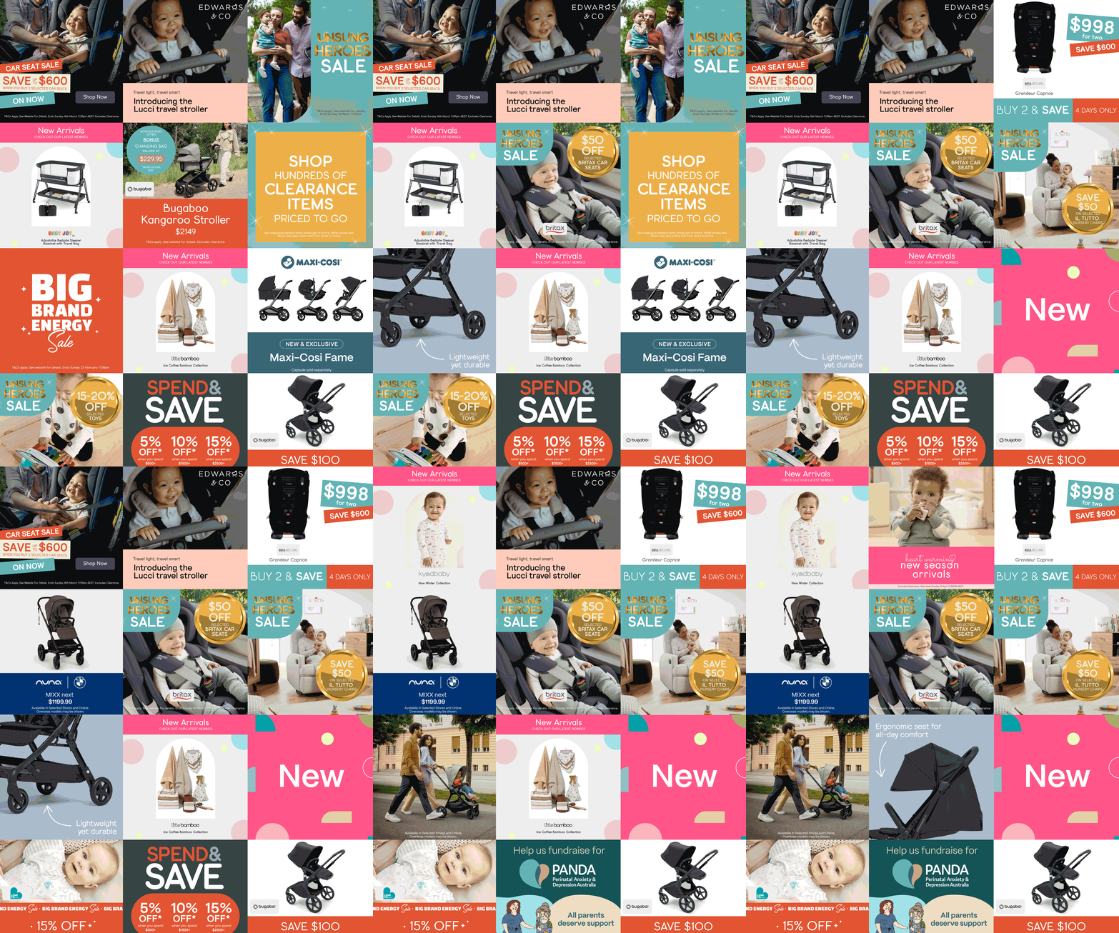

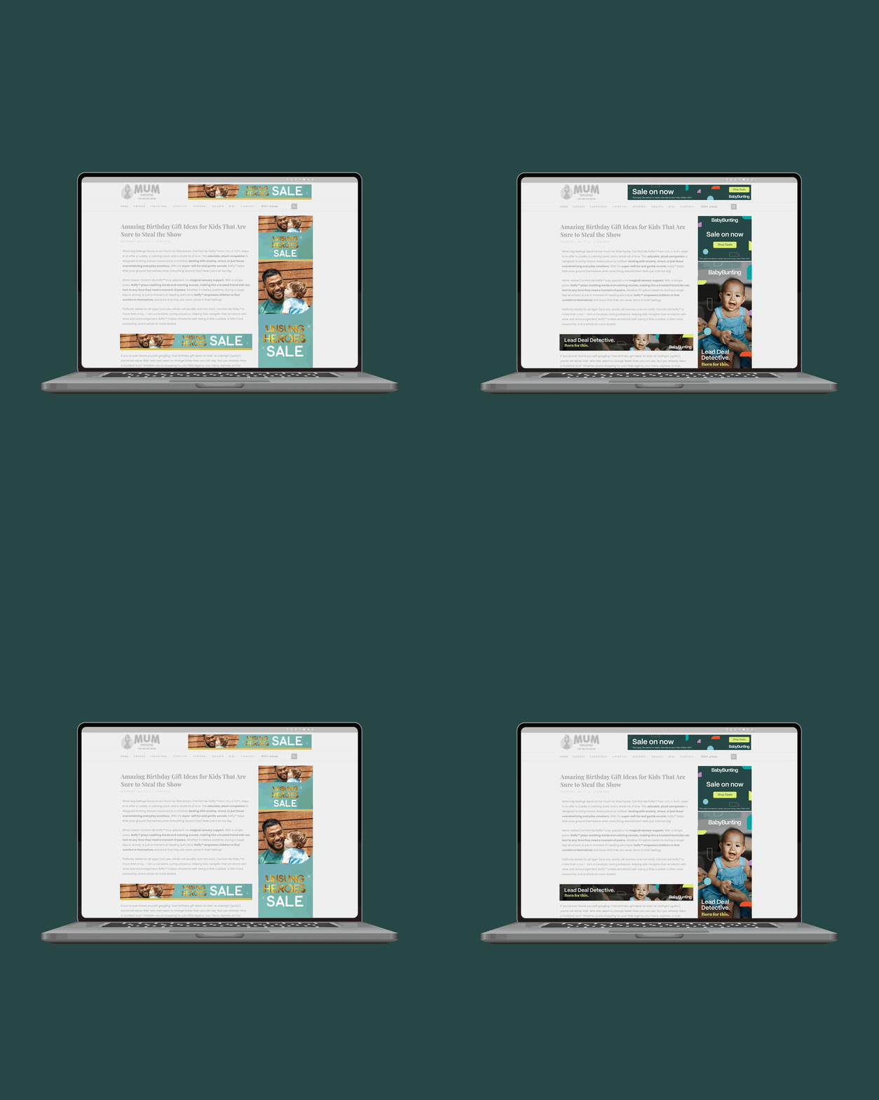
I came in to assist the digital graphics rollout, working across social media assets, EDM templates and animated email components in Figma. Alongside producing production-ready files, I worked through the practical gaps the system threw up at execution stage, stress-testing the identity across formats and making the guidelines more concrete and workable as the rollout progressed.
Client
Baby Bunting
Disciplines
Digital Graphics (Figma)
Social Media
EDMs
Typography
Animation
Agency
Luisa Scoppa Design