

Little by Care Pharmaceuticals
Care Pharmaceuticals' paediatric range had a problem that wasn't immediately obvious: the products were genuinely good, but they were invisible as a brand. Five products spanning iron supplements, cough, eye care, laxative and allergy categories, each ranged in a different section of the pharmacy, each looking different, none of them visually connected. Larger brands dominated every category. For parents navigating a busy pharmacy with a sick child, there was no thread to follow, no reason to recognise and return to the Little range.

The brief was to create an umbrella brand identity that would unify the range under a single positioning, "the experts in children's health" and give parents a consistent brand to find and trust, even when the products lived on opposite sides of the store.
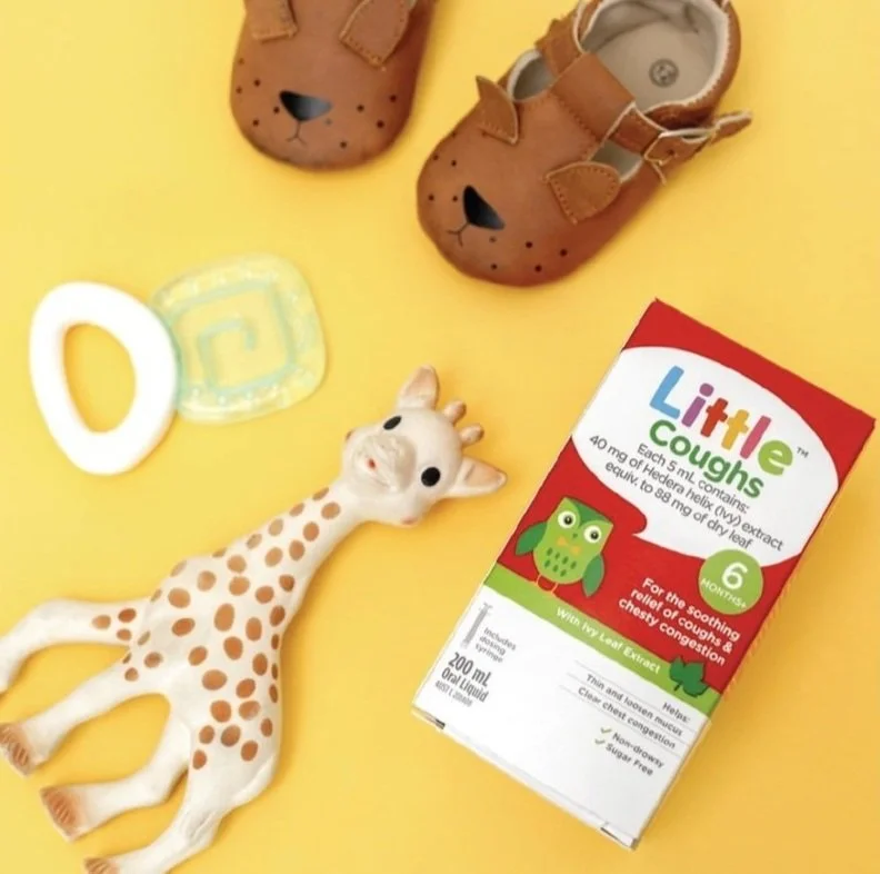
The range has been in Australian pharmacies ever since. In 2026, Care Pharmaceuticals launched a national multi-channel campaign for the Little brand across digital, outdoor, cinema and parenting platforms, nearly a decade on from the original design.


Client
Care Pharmaceuticals
Disciplines
Strategy
Brand identity
Brand asset creation
Packaging design
Typography
Illustration
Agency
Luisa Scoppa Design
Anthem/SGK
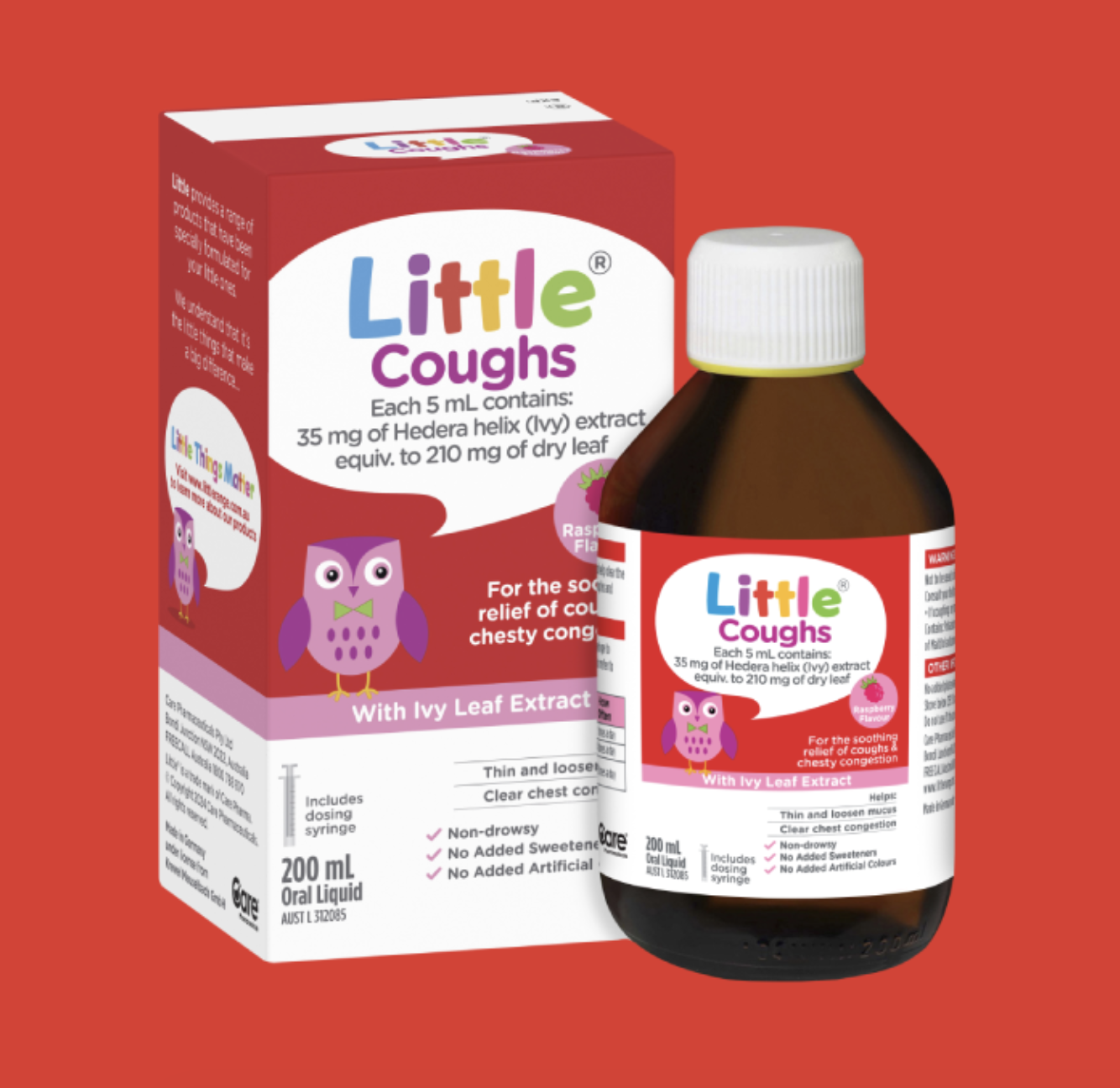
As the lead designer, I developed the full brand identity and packaging across all five SKUs. The Little wordmark in its speech-bubble cloud, the warm and playful tone, and the colour-coded "wise owl" character (a different owl personality for each category) gave the range a cohesive visual logic that worked both as a standalone pack and as a family. Parents encountering Little Eyes in the eye care aisle and Little Coughs in the respiratory section would recognise the same brand without needing to be in the same aisle.