Love to Dream
Packaging Refresh
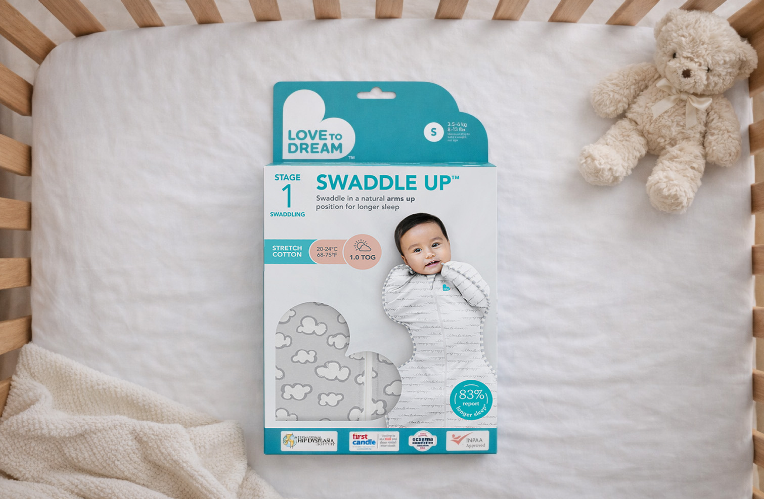
Love to Dream is one of Australia's most recognised baby sleepwear brands, a market leader stocked in 50 countries and built around its patented arms-up swaddle design. Rapid international growth had created real complexity across the packaging portfolio: multiple variants in circulation, inconsistent naming conventions between regions, and genuine confusion for shoppers trying to navigate sizing, temperature suitability and product stages. For a brand built on reassuring new parents, this was a problem worth solving properly.
Clarifying the shopper experience
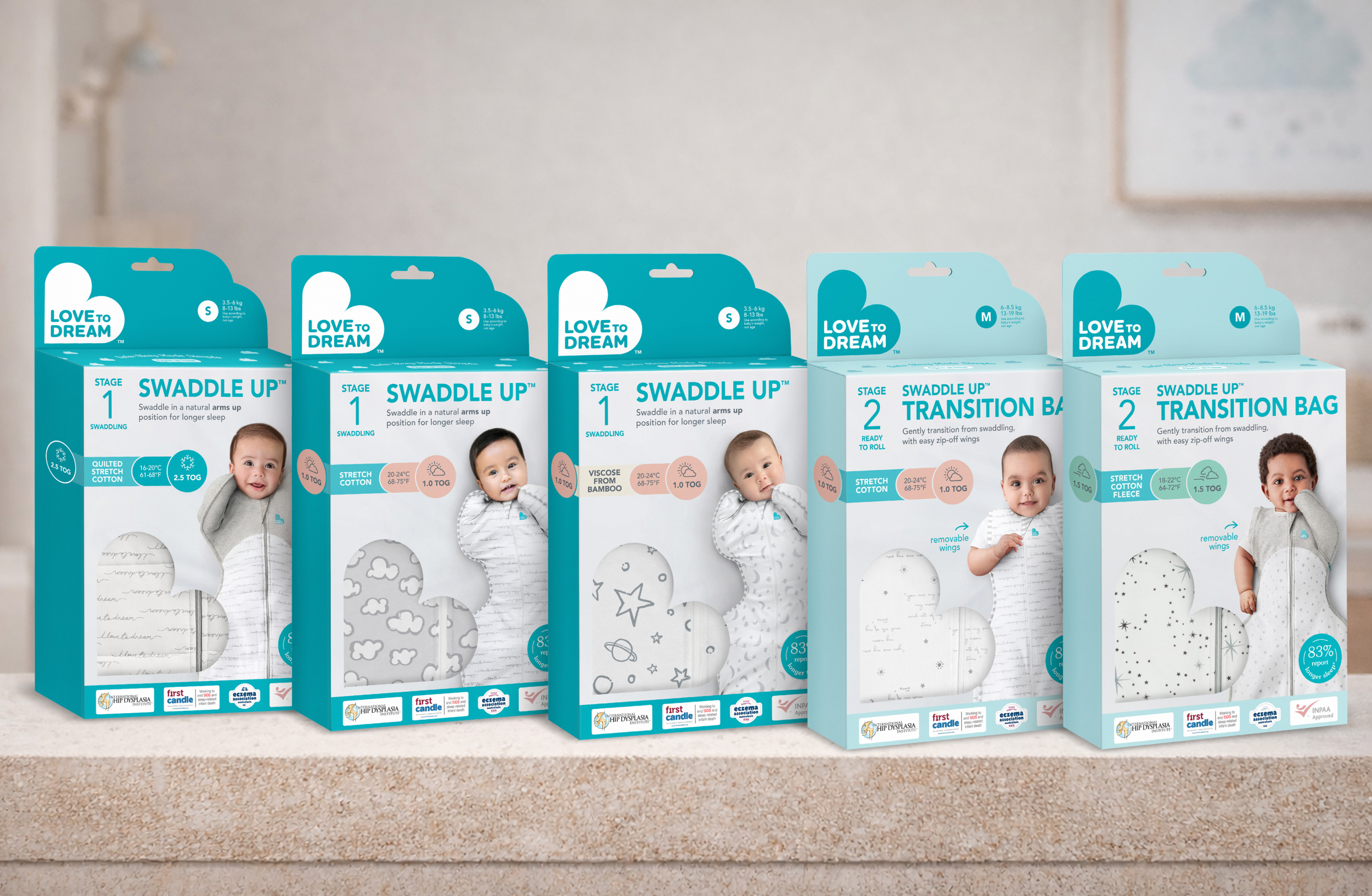
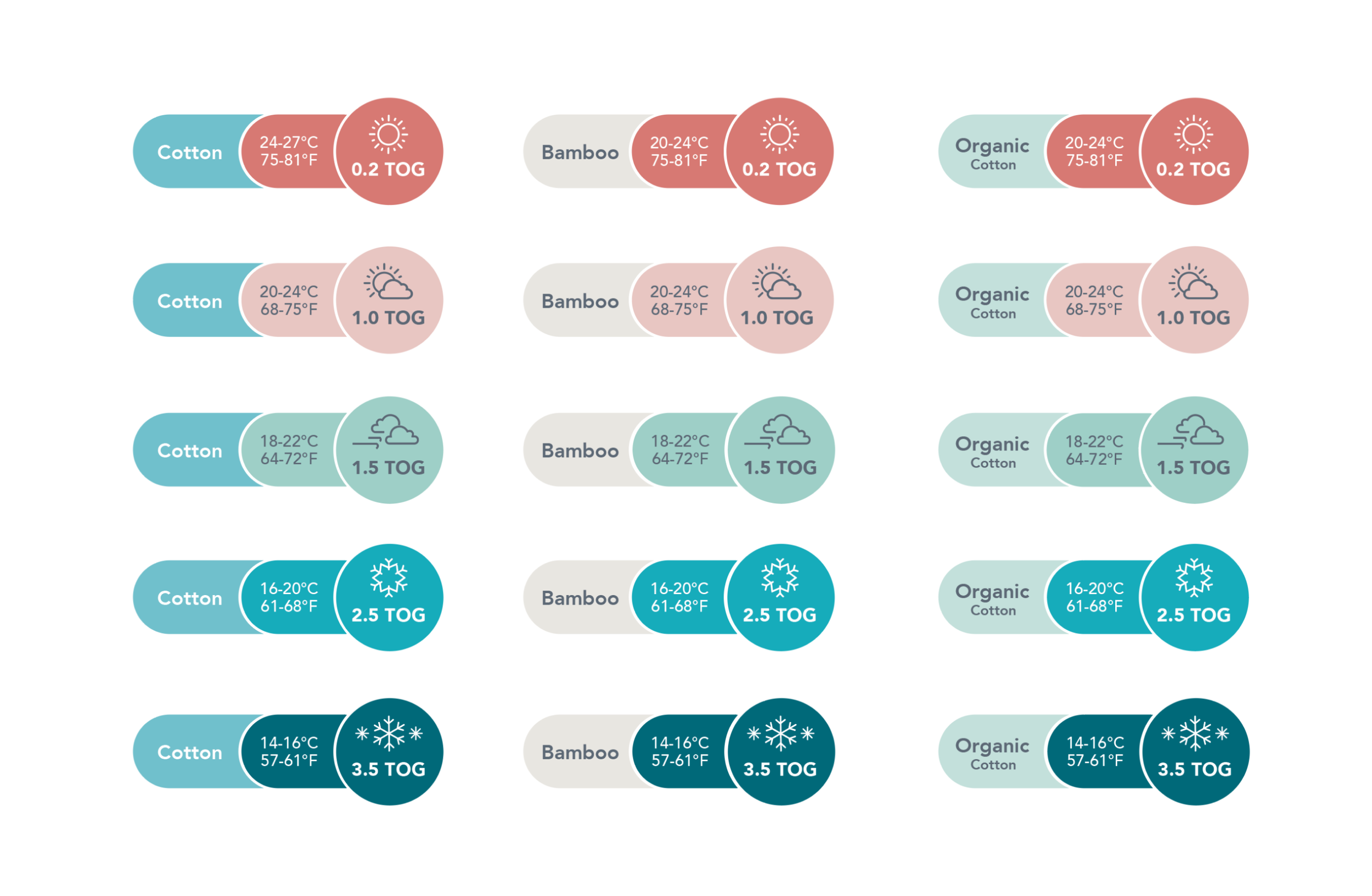
I began with a comprehensive audit of all packaging in market (more than 50 SKUs including all global variations) to map inconsistencies and identify the real pain points from both a brand and consumer perspective. I standardised the product naming into a logical, scalable system and rebuilt the messaging hierarchy so that stage, size, season and TOG rating could be understood at a glance, without parents having to work for the information.
*TOG is a universal thermal rating system used globally to indicate a garment’s warmth, a critical purchase factor for sleep safety.
Global variations
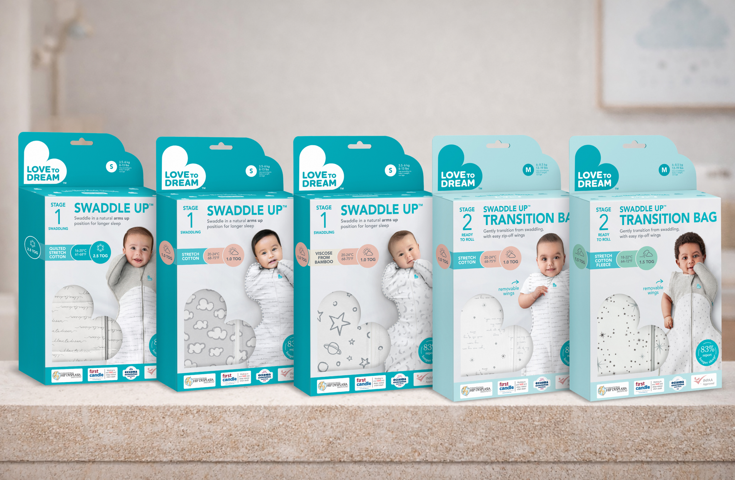
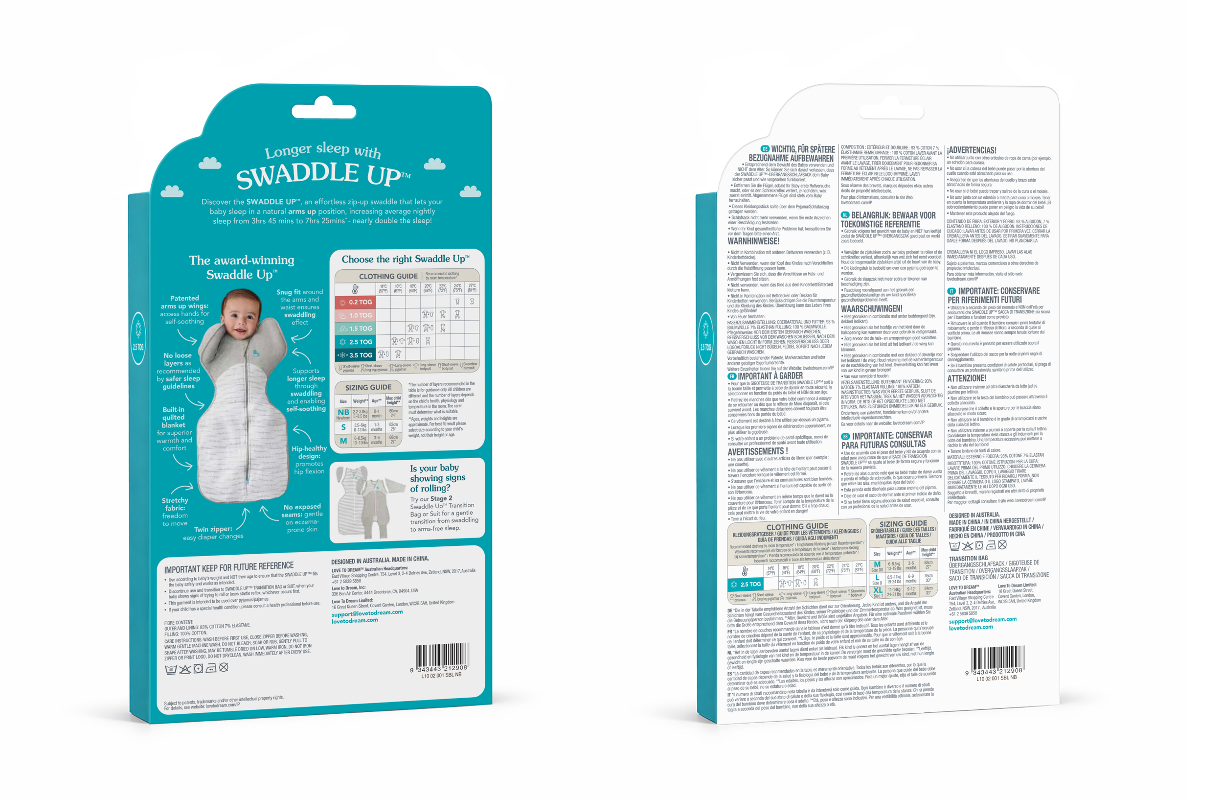
Previously, Love to Dream had multiple packaging versions in circulation to meet regional language and compliance requirements, leading to duplicated artwork, higher print volumes and inconsistent brand execution. I introduced a consolidated multilingual packaging system that accommodates multiple languages within a single design, reducing the number of individual SKUs needed per market and streamlining global production and inventory without compromising regulatory clarity.
Stage differentiation & brand alignment
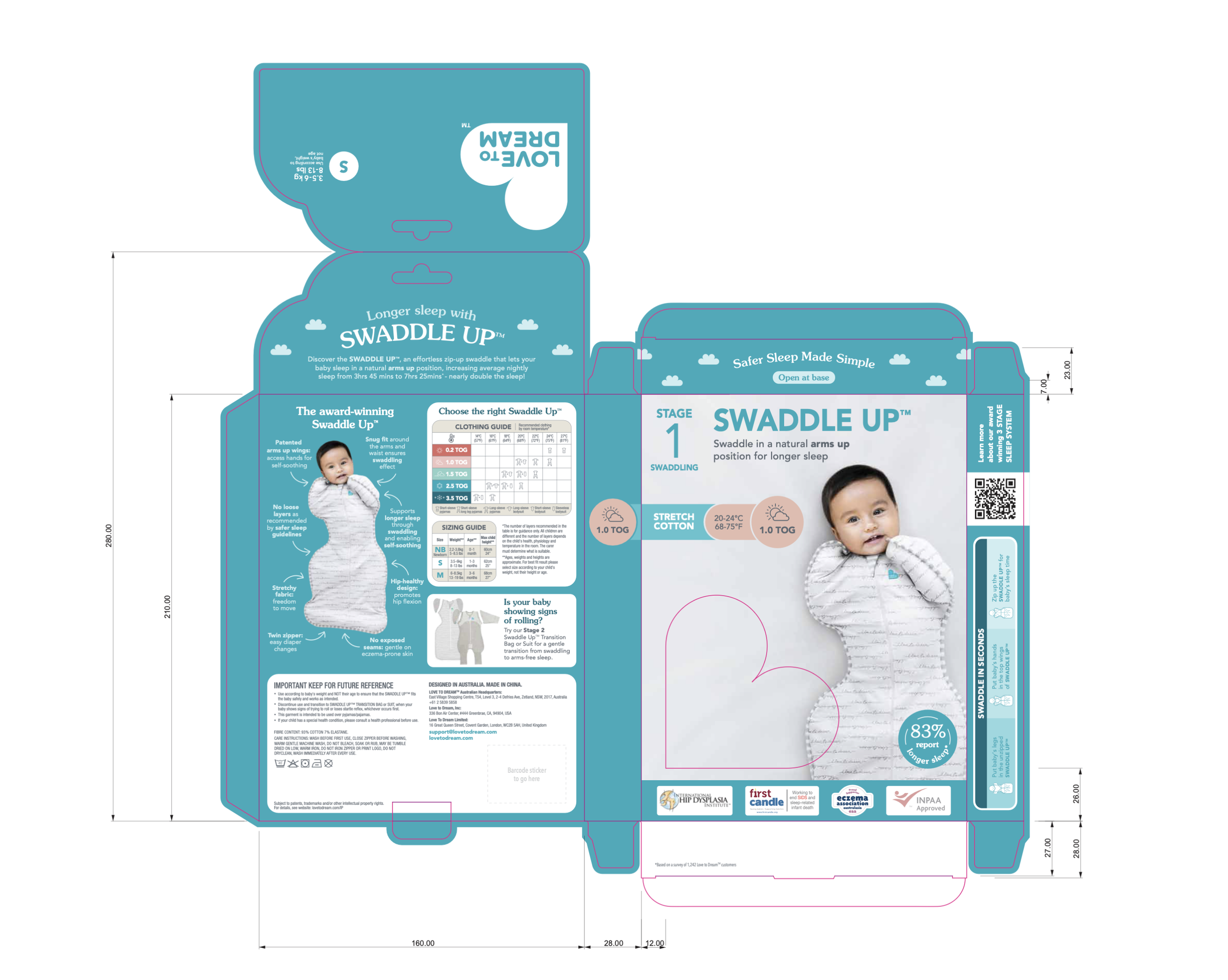
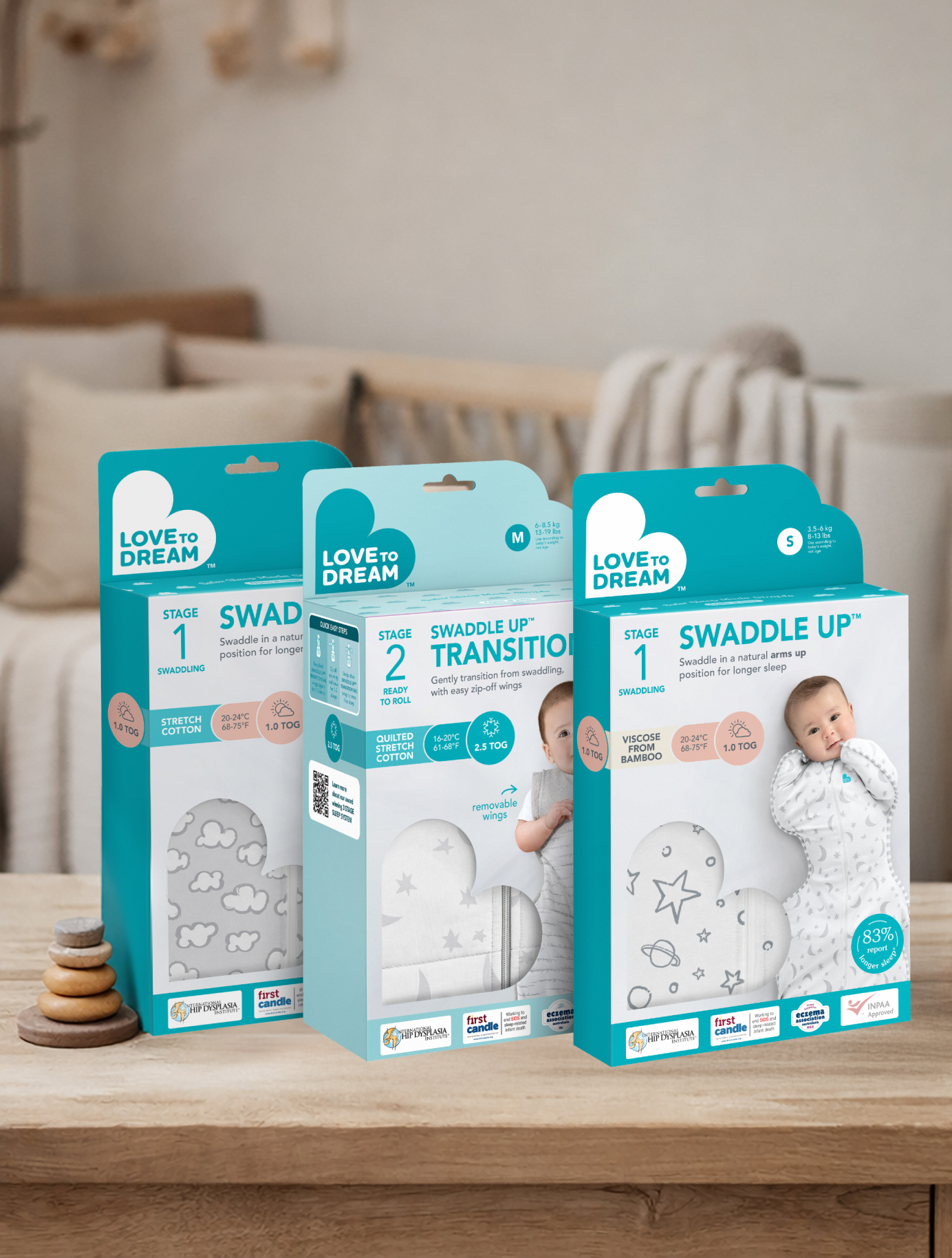
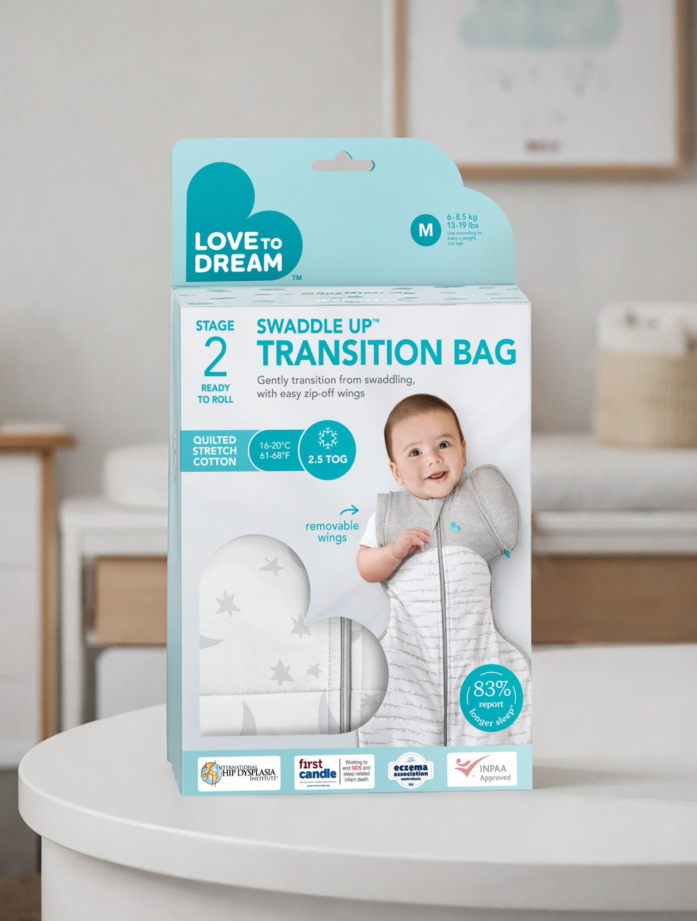
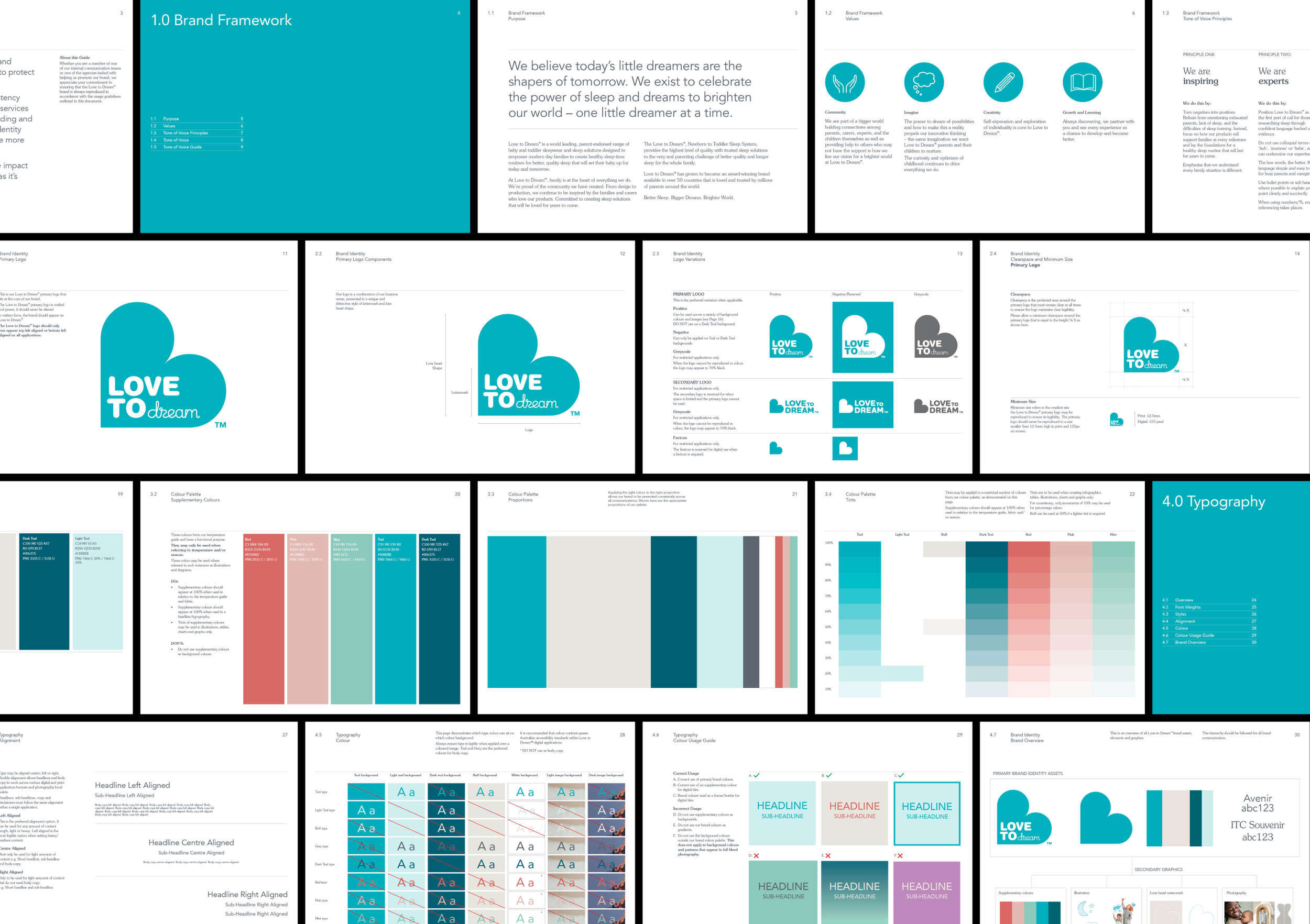
Stage 1 (Swaddle) and Stage 2 (Transition) required clearer visual separation, particularly for time-poor new parents making quick decisions in store. I aligned the full packaging system to the updated global colour palette and brand guidelines, ensuring consistency across retail, ecommerce and international markets. Alongside the design work, I developed a streamlined briefing and production system for the internal team to reduce ambiguity and remove bottlenecks with printers and international markets.
Artwork delivery
Ensuring colour consistency across multiple offshore printers was one of the more demanding aspects of the project. Despite shared PMS specifications, output varied significantly between regions due to differing print technologies and material stocks. I led extensive colour testing and proof alignment against the updated master palette to ensure the packaging felt identical wherever it landed on shelf.
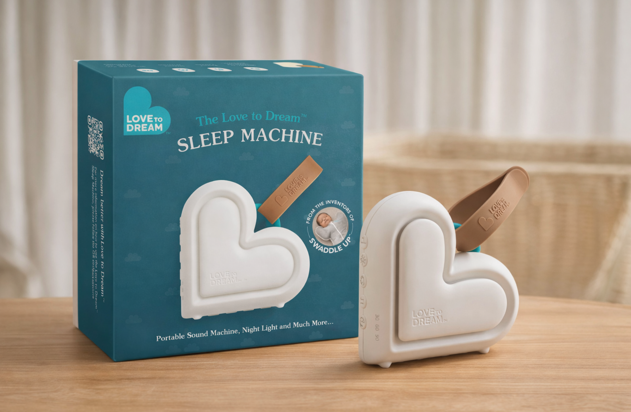
The sleep machine
The Sleep Machine extended the packaging project into new territory. As a feature-led electronics product, it required a different approach to hierarchy by communicating nine sound modes, cry detection, a customisable voice recording and night light function clearly and confidently, without departing from the brand system applied across the rest of the range.
Parents can now find the right product faster and with more confidence, reducing confusion at a critical decision moment and reinforcing trust in Love to Dream as a sleep expert.