Why health food packaging all looks the same
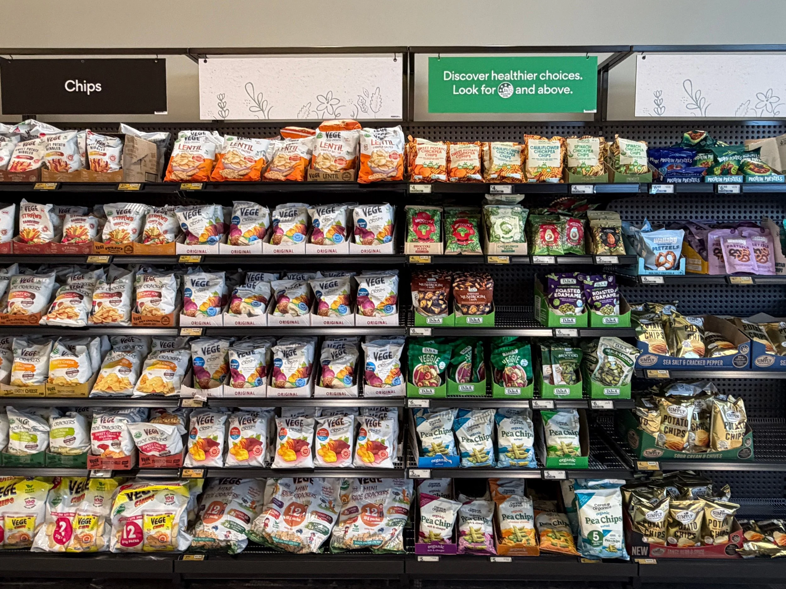
Walk the health food aisle at any Australian supermarket and give yourself thirty seconds to look without focusing on any one product. What you'll notice is a kind of visual blur. Kraft paper, muted greens, earthy browns, cream and oat tones, a leaf or a seed somewhere in the logo. Combined with a version of "natural," "wholesome," or "honest" in the copy - and on the back of every pack, a founder who genuinely believes their product is different.
How the category got here
The visual language of health food packaging developed as a response to the mainstream. Conventional grocery brands were loud and bright so health food brands became quieter and minimal. Kraft paper and muted palettes communicated - we're not like them - we're honest!
For a while that contrast worked and a product that looked visibly different to the mainstream stood out precisely because of that difference. But as more brands adopted the same visual cues, the signal stopped signalling anything and became the default.
The brief that creates the problem
Most health food founders brief their designer with the same set of words of “Natural”, “Clean”, “Wholesome”, “Honest”, “Minimal”. These values are real and they matter to the brand - but they're also the values of almost every other brand in the aisle, which means a designer working from that brief is likely to produce something that looks like everything around it.
The brief needs to not just include what the brand believes, but who exactly it's for, what it stands for that no one else in the category is saying, and what the packaging should feel like to own versus any of the twenty products beside it. Those answers are what produce a distinct visual direction.
What the smarter brands are doing
The health food aisle isn't standing still and brands gaining traction are starting to borrow from adjacent categories, using stronger colour, more confident typography, and appetite driven photography (no more gluten-free crackers that look like they will taste like cardboard), and a tone of voice that has genuine personality rather than generic wellness language. Gluten free and allergy-friendly brands in particular have started moving away from the "this is for people with a problem" aesthetic toward something that looks and feels like a positive choice rather than a compromise on taste.
What still differentiates
In a category where every brand looks natural, the ones that stand out are the ones with a specific point of view. A clear hero claim that answers one question rather than five competing claims, or a colour or illustration style that no one else in the bay is using. None of this actually requires abandoning natural cues - a product can still communicate health, provenance, and clean ingredients without looking like the thirty competitor brands beside it. The question is whether you've made a deliberate choice about how to do that, or whether you've defaulted to the category template and hoped for the best.
Where you're sold changes what your packaging needs to do
A product sold at Harris Farm or a specialty health retailer sits in a different context to one in the health section at Woolworths or Coles. The Harris Farm shopper spends more time, reads more, and is more likely to be comparing on ingredients. The mainstream health section shopper is moving faster and making decisions with less deliberate thought. Packaging designed for one environment doesn't automatically translate to the other as what looks refined and considered in a specialty context can disappear in a louder, more competitive setting. Knowing exactly where your product needs to perform, and designing for that specific context rather than for a generic "health consumer," is one of the most commonly skipped steps.
What to do before you brief a designer
Before any design work begins, the brief should be able to answer: who exactly is this for, what does it do for them that nothing else in this aisle does, and where is it going to be sold? Those answers are what give a designer something distinctive to work with.
If you're building a health food brand and want packaging that's designed to stand out rather than fit in, get in touch or take a look at how I work with food and wellness brands.