What beauty founders get wrong about packaging
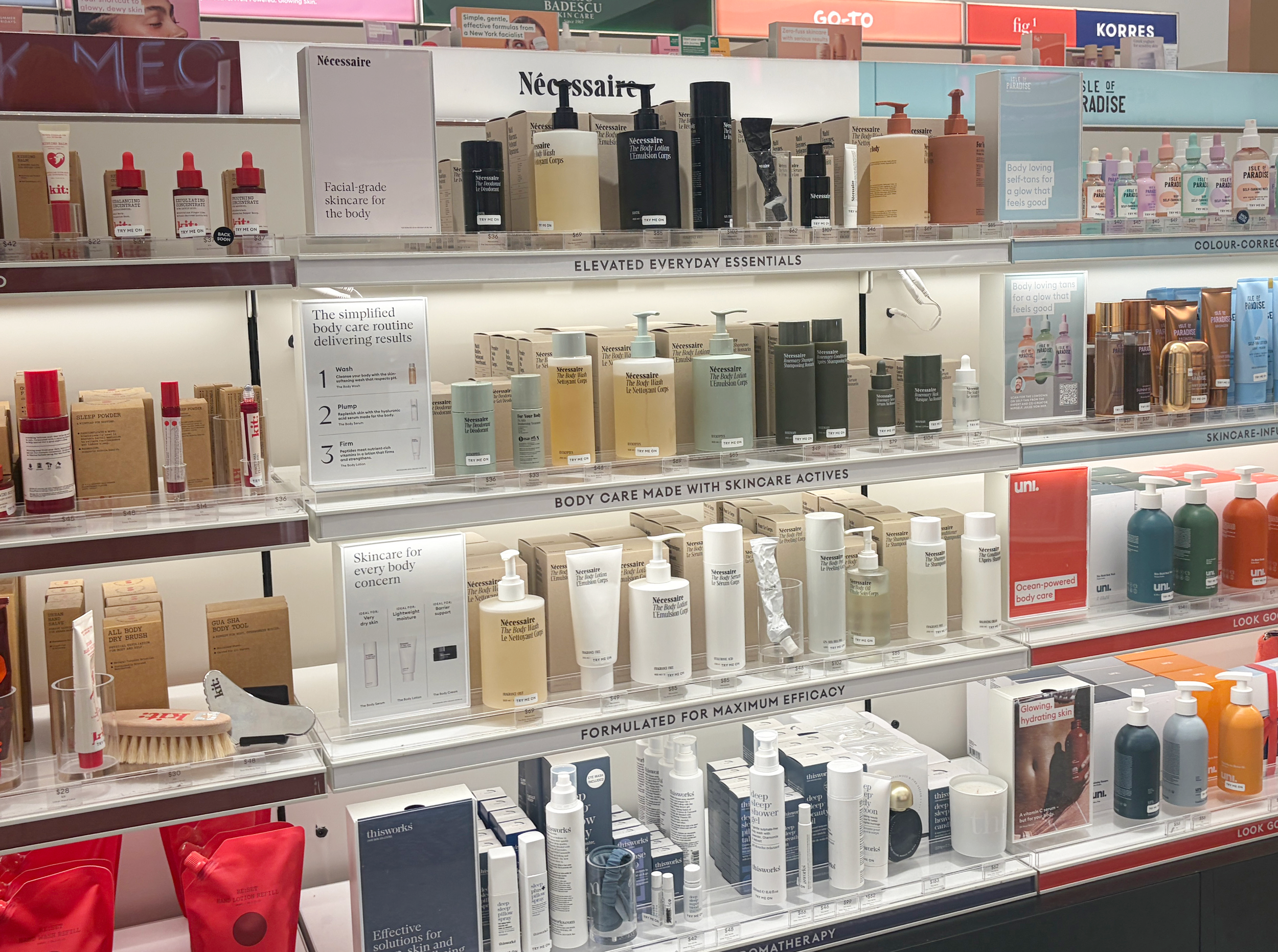
Beauty is the most visually saturated category on shelf. Every product looks considered and every brand has a clean aesthetic and premium finish. In a category where looking good is the baseline, polish alone is not enough of a differentiator.
This is the trap most beauty brand founders fall into. They invest in making their packaging beautiful (and it is beautiful) but it doesn't sell. Because beautiful and clear are not the same thing, and it's clarity that drives purchase decisions in a two-second shelf scan.
The category is more competitive than it looks
Walk the beauty aisles at Priceline, Chemist Warehouse or Mecca and you'll see the problem immediately. Hundreds of products, all premium looking and all competing for the same attention. A consumer who isn't already loyal to a brand isn't choosing the prettiest option - they're choosing the one they understood first.
That means your packaging has to communicate who it's for, what it does, and why it's different before the consumer has consciously decided to look at it. If that's not clearly communicated within a couple of seconds, you've lost them to a competitor.
Looking premium is no longer enough
The cost of premium packaging production has come down significantly. Finished such as foiling, matte finishes, spot UV gloss, soft-touch laminates all are used to signal investment and quality. Now they're so commonplace in the category that they signal almost nothing. A brand that relies entirely on a premium aesthetic to differentiate is competing in a game that almost every other brand is playing.
The way around this is to differentiate by having an ownable visual identity. A specific point of view or brand story that carries through from the colour palette to the typography to the way the copy is written. The brands that hold shelf space in competitive beauty environments are usually the ones where every design decision serves the positioning, not just the aesthetic.
Positioning has to come before design
The most common mistake I see is briefing a designer before the brand strategy is settled. The result is packaging that looks considered but doesn't actually say anything specific. It could be any brand in the category. That's a problem, because category buyers and consumers are both making fast decisions, and looking nice isn't a reason to choose one brand over another.
Before any design work starts, you should be able to answer: who exactly is this for, what does it do for them that nothing else does, and where is it going to be sold? The design problem is how to make those answers visible at a glance.
What Australian beauty retail actually demands
Priceline, Chemist Warehouse, and Mecca are different retail environments with different consumers and different shelf dynamics. Priceline skews toward a more considered, brand aware shopper. Chemist Warehouse is high volume, price visible, and noisy. Mecca is curated and experience led, with a shopper who is actively seeking out new brands and willing to pay for quality, but who also has a very high visual bar because everything around your product looks exceptional. A brand that works in one of these environments doesn't automatically work in the others, and packaging designed without a specific retail destination in mind often ends up compromised across all of them.
Beyond aesthetics, all retailers have technical requirements: label specifications, barcode placement, minimum font sizes for claims, and packaging formats that fit within standard planogram allocations. Getting ranging approval and then discovering the packaging needs to be reworked for compliance is one of the most avoidable and expensive problems in this category.
Design decisions that shape perception
Colour, finish, structure, and proportion all communicate before language does. A matte black pack signals sophistication while a white with minimal colour pack signals clinical efficacy or clean beauty. A warm, earthy palette signals natural or organic positioning. These cues set up an expectation, and the rest of the design either confirms or contradicts it.
When those signals are inconsistent, or when the visual language is borrowed from another brand rather than built around a genuine positioning, consumers sense the disconnect and this affects their trust.
What to do before you brief a designer
Get clear on your positioning first and know exactly who you're designing for and what retail environment you're designing for. Have a competitive shelf reference, this is not a mood board of brands you admire, but an actual photo of the shelf your product needs to compete on. A good designer will ask for all of this before they start.
If you're building a beauty brand and want packaging designed to compete in the Australian retail environment, get in touch or take a look at how I work with beauty and personal care brands.