The psychology of shelf standout
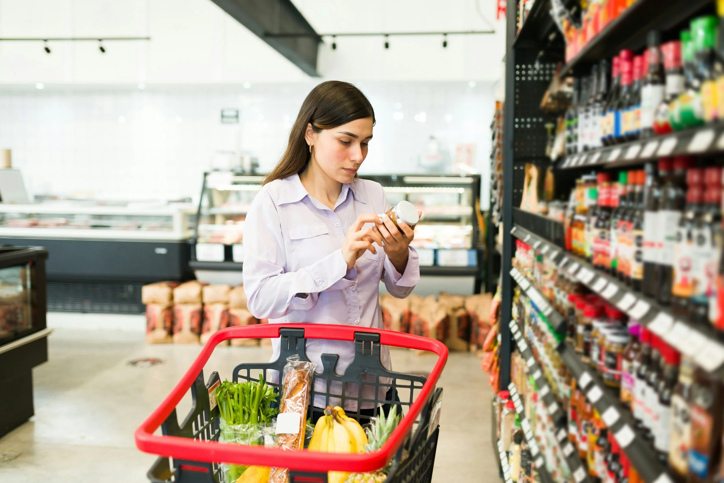
When shoppers walk down the supermarket aisle, they're not making considered decisions. In most categories, a consumer will spend under two seconds looking at a shelf before they've moved on or reached for something, which means your packaging has to do a lot of work, very quickly.
Understanding how people respond to design in that moment is what separates packaging that performs from packaging that just exists.
Colour works before words do
Colour is the first thing the brain registers, before the category, the brand name, or the benefit claim. It sets an expectation about what the product is and who it's for before a single word is read. In the cereal aisle, vibrant primaries speak to children while earthy, muted palettes lean into health and naturalness. The right colour choice becomes a subconscious signal, and the wrong one creates confusion that most shoppers won't stop to resolve.
Messaging hierarchy matters more than people think
Shoppers don't read packaging. They scan it. A clear hierarchy where brand, product name, and key benefit land in the right order makes the job easy for them. When too many messages compete for attention at once, none of them register. The instinct to put everything on the front face is understandable, but it usually results in packaging that communicates nothing clearly.
Finishes and textures shape perception
Matte surfaces suggest naturalness or restraint while gloss adds energy or indulgence. Embossing and foiling signal quality and justify a higher price point. These aren't decorative choices; they're decisions that shape how a product feels before anyone has opened it. That physical moment of picking something up is often underestimated in how much it influences the final decision.
Context is everything
Packaging doesn't exist in isolation on the shelf. It sits next to competitors, under inconsistent lighting, sometimes behind frosted glass, sometimes in a shelf-ready tray. Designs conceived for e-commerce often struggle in-store because the competitive environment was never part of the brief. Online, a product is typically viewed against a white background in isolation, so bold, flat graphics can look effective. In-store, those same packs can disappear into a wall of colour and noise if they weren't designed to differentiate in that setting.
Shelf standout is both a design and a strategy problem. The brands that get it right are usually the ones who understood the environment their product was walking into before they briefed a single visual.
If your brand needs packaging that competes confidently in-store as well as online, get in touch to learn more.