
How Packaging Design Affects Shelf Performance
Packaging design isn't just about aesthetics, it's about shelf performance. Here's how design decisions affect the way shoppers find, read and choose your product in a competitive retail environment.
There's a moment in every grocery shop that happens without thinking. You approach a shelf, your eyes scan across the options, and within a few seconds, one product either holds your attention or it doesn't. That moment, repeated by millions of shoppers every day, is where packaging design either earns its keep or fails quietly.
Shelf performance isn't a marketing metric. It's a design metric. And the two are connected in ways that most brands don't fully understand until they're standing in a supermarket watching their product get passed over.
What "shelf performance" actually means
Shelf performance is simply how well a product competes in its retail environment. Not how beautiful it looks in isolation, not how impressive it photographs for a brand deck, but how it performs when it's one of twelve options competing for a shopper's attention in under three seconds.
The conditions are unforgiving. Most FMCG shoppers aren't browsing, they're completing a task. They're tired, distracted, and time-poor. Brand loyalty helps, but even loyal buyers need a clear cue to find what they're looking for. For first-time buyers, the job is harder: the packaging has to interrupt the scan, communicate what the product is and why it's worth picking up, and overcome any hesitation, all before the shopper moves on to the next shelf. That's not a creative brief. It's a competitive challenge.
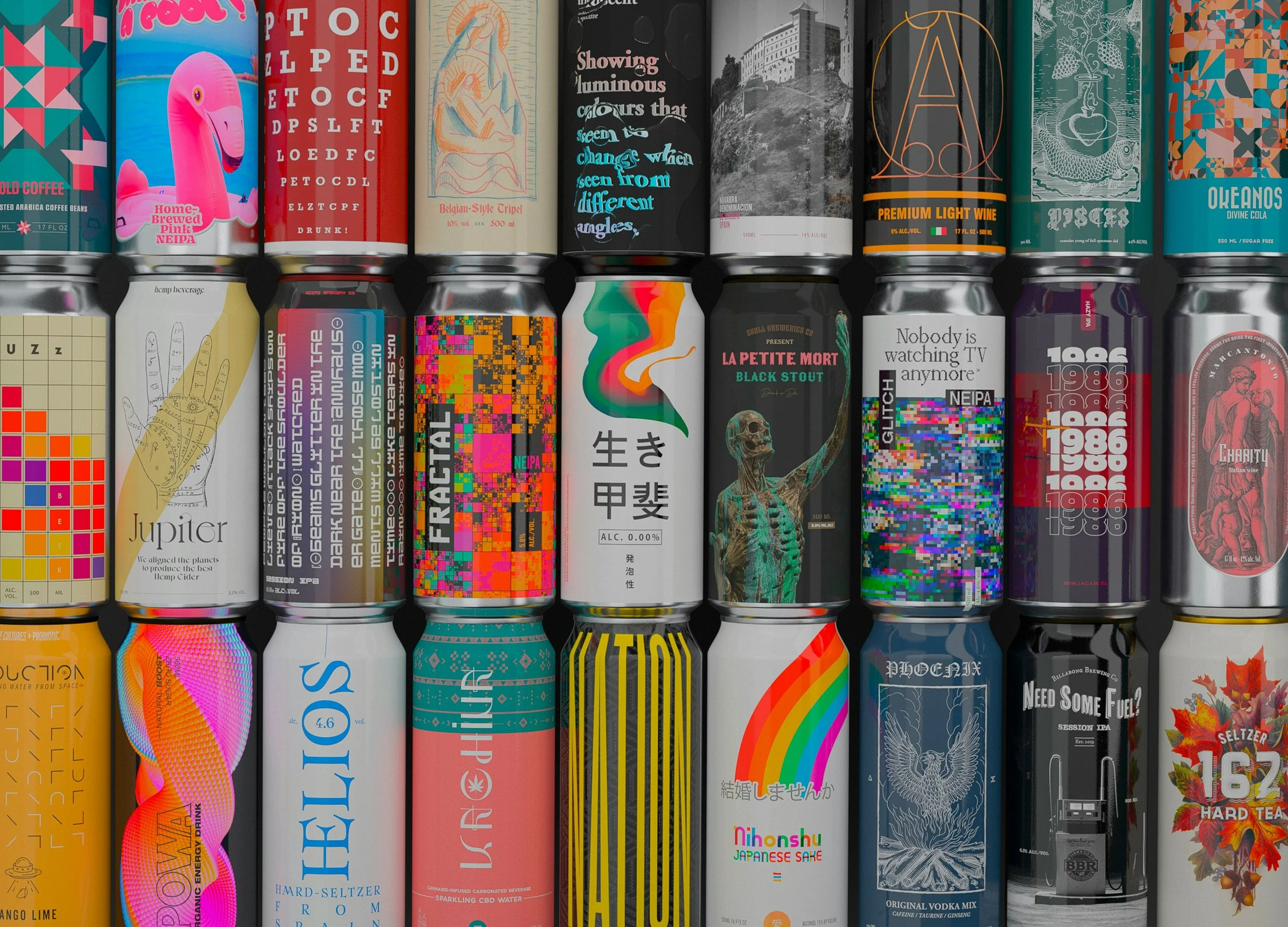
The design decisions that actually matter at shelf
Colour is often treated as a branding choice. At shelf, it's a navigation tool. Consistent colour coding across a range helps shoppers locate their variant quickly, especially in complex ranges with multiple SKUs. The brands that get this right don't just choose "on-brand" colours, they build a system that works across the entire range, at distance, and in the context of a busy fixture.
Hierarchy matters more than most brands realise. The question isn't just what information goes on the pack, but in what order does a shopper read it, and does that order serve them or confuse them? Brand name, product descriptor, key claim: these three elements need to be sequenced and sized so that a shopper can process them without effort.
Appetite appeal and sensory cues are particularly important in food and beverage. A product that looks good, that cues taste, freshness, or quality through its photography and design, performs better than one that communicates the same information without that sensory layer. This is why the shift in health food packaging toward more colour and appetite appeal has been commercially driven, not just aesthetically motivated.
Range navigation is where many brands struggle as they grow. What starts as a clean, consistent system across three SKUs can become genuinely confusing by the time it reaches twelve. The variants need to be clearly differentiated from each other while still reading as part of the same family. When this breaks down, shoppers pick up the wrong variant, put it back, and sometimes abandon the purchase entirely.
The strategic layer underneath the design
Here's what purely aesthetic approaches to packaging miss: design can't fix a positioning problem. If a brand hasn't clearly defined who it's for, what it offers, and why that matters in the context of its category, the packaging will reflect that confusion regardless of how well it's executed visually.
The work I find most interesting starts before any design decisions are made. It starts with understanding the category, the consumer, the retail environment, and where the brand can legitimately own something distinctive. The packaging that performs best at shelf is almost always the packaging that comes from a clear strategic foundation.
This is what the Three Blue Ducks brief looked like in practice. The challenge wasn't just to create packaging that looked like them, it was to translate a brand built on authenticity and real food into packaging that could compete in major grocery retail without losing what made it distinctive. The result (which won Silver at the 2024 Indigo Design Awards) worked because the design served the brand strategy, not the other way around.
The right question to ask before any packaging project
If you're developing or refreshing packaging for the Australian market, the most useful question you can ask isn't "what should it look like?" It's "what does this packaging need to do, in what environment, for what shopper, and against what competition?"
Answering those questions properly shapes everything that follows: the design direction, the hierarchy, the colour decisions, the photography approach, the range navigation system. It's what separates packaging that performs on shelf from packaging that simply exists on it.
If that's the kind of thinking you're looking for, get in touch.